4.8 KiB
flib includes several GUI styles for your use and convenience. For help and information on how to use these styles effectively, refer to the work-in-progress GUI style guide.
IMPORTANT: Modifying these styles in any way will modify them for all mods using them. Therefore, unless you are specifically creating a GUI skin mod, DO NOT MODIFY THESE STYLES! Instead, create your own new styles using these styles as parents, then modify those new styles as you wish.
Button styles
flib_selected_frame_action_button
A "selected" frame action button. Use when a frame action button can "toggle" on and off.
flib_selected_tool_button
A "selected" tool button. Use when a tool button can "toggle" on and off.
flib_tool_button_light_green
A light green tool button. Similar to the item_and_count_select_confirm style, but has margin and padding fixes to match other tool buttons.
flib_tool_button_dark_red
A dark red tool button, similar to the red shortcut button style.
Slot styles
flib includes a myriad of colored slot styles for use with sprite-buttons:
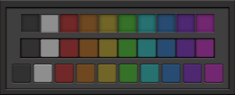
There are three categories of style, from top to bottom: slot, slot_button, and standalone_slot_button. From left to right, the colors are default, grey, red, orange, yellow, green, cyan, blue, purple, and pink.
The styles are formatted as flib_CATEGORY_COLOR. For example, if I want a pink standalone slot button (bottom-right on the preview image), I would use flib_standalone_slot_button_pink.
Each slot style also has a selected variant, which uses the hovered graphics as default. This is intended to let a user "select" a button, and to let the mod visually distinguish it from other buttons around it. To use these styles, replace flib_ with flib_selected_ in the style you wish to use (e.g. flib_selected_slot_button_green).
Empty widget styles
flib_dialog_footer_drag_handle
A drag handle suitable for placement in the footer of a dialog window.
flib_dialog_footer_drag_handle_no_right
A dialog footer drag handle with the right margin removed. Suitable for dialog windows without a confirm button.
flib_dialog_titlebar_drag_handle
A drag handle suitable for placement in the titlebar of a dialog window. Use inside of a flib_titlebar_flow flow.
flib_horizontal_pusher
An invisible element that has horizontally_stretchable set, thereby "pushing" everything to the right.
flib_titlebar_drag_handle
A drag handle suitable for placement in the titlebar of a standard window (a window with a close button, or any other frame action buttons in the titlebar). Use inside of a flib_titlebar_flow flow.
flib_vertical_pusher
An invisible element that has vertically_stretchable set, thereby "pushing" everything to the bottom.
Flow styles
flib_indicator_flow
A flow designed for use with indicators (see below).
flib_titlebar_flow
A flow for use in a custom window titlebar. Identical to a regular horizontal flow, except for an increased horizontal spacing.
Frame styles
flib_shallow_frame_in_shallow_frame
A shallow frame nested in another shallow frame. Use of this is generally recommended against, but can be useful in some specific situations.
Image styles
flib_indicator
A 16x16 image style. Designed for use with flib's indicator sprites (see sprites.md).
Scroll pane styles
flib_naked_scroll_pane
A marginless scroll pane for use inside of content panes. When activated, it draws a shadow around its edges to give a more "inset" effect, to make it more obviously scrollable. The content is given an automatic 12px padding.
flib_naked_scroll_pane_under_tabs
Identical to flib_naked_scroll_pane, but has an inset on the top side when activated. Designed for use inside of a tabbed_pane_with_no_side_padding when not using a toolbar.
flib_naked_scroll_pane_no_padding
Identical to flib_naked_scroll_pane, but has no padding for the content that's put inside. Useful for wrapping a table in a scroll pane, for example.
flib_shallow_scroll_pane
A scroll pane that is inset from a shallow frame, instead of an outer frame.
Tabbed pane styles
flib_tabbed_pane_with_no_padding
A tabbed pane with no padding whatsoever on the content container. Useful for specific situations where you need to have full control of the content padding.
Textfield styles
flib_widthless_textfield
A textfield with no width defined on it. The default textfield style has a width of 200, which can wreak havoc.
flib_widthless_invalid_textfield
A widthless textfield that has a red background. Suitable for situations where the content of the textfield is invalid in some way.